
If you’ve ever uploaded a professional resume and wondered, “Did the system read that right?”, you’re not overthinking it. An ATS (applicant tracking system) turns your resume file into plain text, then tries to label it into fields like name, title, dates, employers, and skills. When the text comes through cleanly, you get credit for the work you’ve done.
Font choice is one of the simplest ways to protect that text’s readability. In 2026, most ATS tools handle common PDFs and DOCX files well, but ATS-friendly resume fonts still matter because odd typography can break spacing, hide characters, or scramble your resume layout.
A quick look at how ATS reads your resume
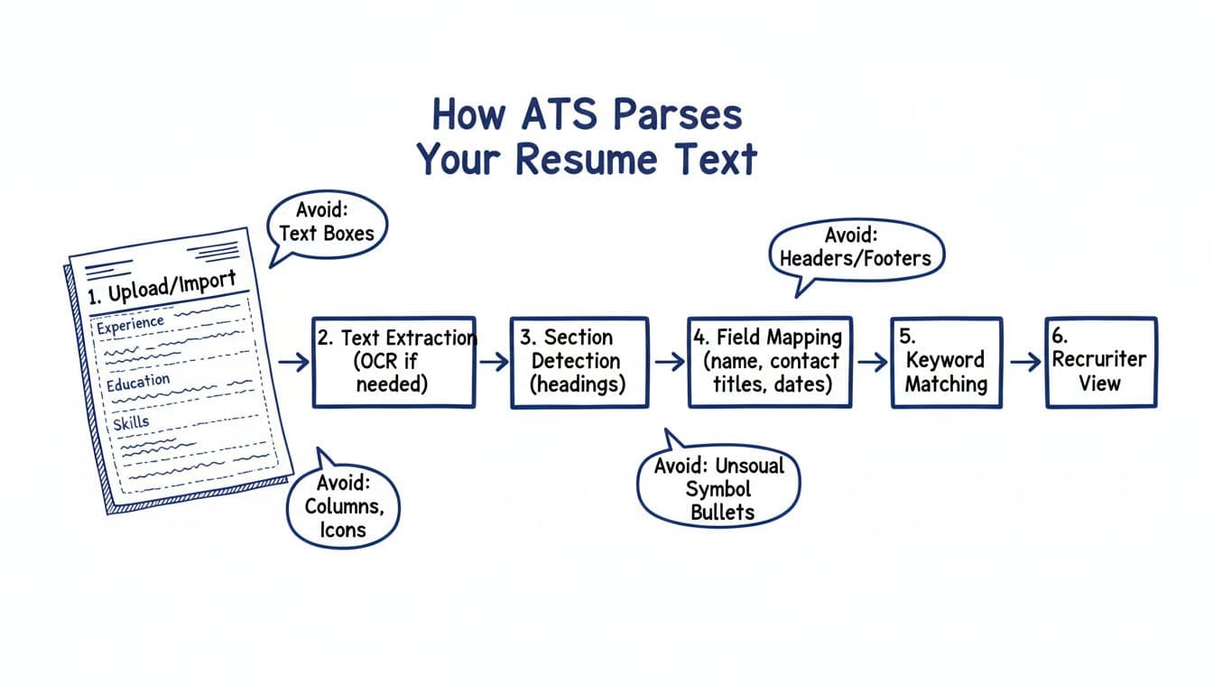
Here’s the practical takeaway from that flow: the applicant tracking system wants predictable, selectable text. Fonts that are widely installed and easy to decode reduce the chance of weird substitutions (when the system swaps your font for something else) and reduce OCR errors if the file gets treated like an image, ensuring smooth extraction before human recruiters review it.
The 8 safest ATS-friendly resume fonts (with exact sizes)
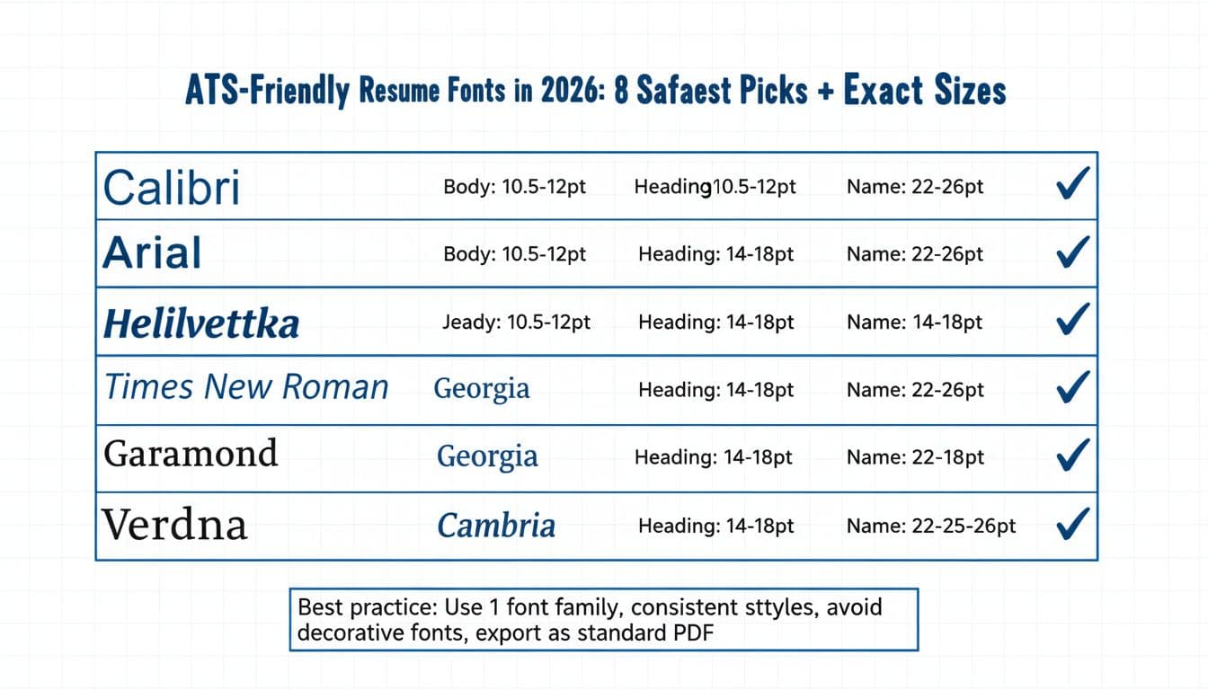
These eight ATS-friendly resume fonts stay popular for a reason: they’re standard fonts, readable at small sizes, and rarely cause parsing surprises.
Font + font size cheat sheet (use this as your default)
Font (safe pick)Best body font size (pt)Safe body range (pt)Heading range (pt)Name range (pt)Notes for parsingCalibri1110.5 to 1214 to 1822 to 26Strong default for modern sans-serif fontsArial1110.5 to 1214 to 1822 to 26Clean shapes, good on screensHelvetica1110.5 to 1214 to 1822 to 26Great, but not on every Windows setupTimes New Roman1211 to 1214 to 1822 to 26Classic serif fonts, space-efficient at 12Georgia1110.5 to 1214 to 1822 to 26Designed for screen legibilityGaramond11.511 to 1214 to 1822 to 26Runs small, don’t drop below 11Cambria1110.5 to 1214 to 1822 to 26Very readable, strong for PDFsVerdana10.510 to 11.514 to 1822 to 26Wide letters, may push to 2 pages
Best default in 2026: Calibri 11 for body text, headings 16, name 24. It’s boring in the best way.
Exact sizing rules that keep both humans and ATS happy
If your resume looks sharp but parses poorly, the problem is often inconsistent sizing or spacing. Set your typography once to establish a clear font hierarchy, then don’t drift.
Body text font size: 10.5 to 12 pt (best default 11 pt)
Section titles (work experience section, Education): 14 to 18 pt (best default 16 pt)
Job titles and employer lines: 11 to 13 pt (match or slightly above body)
Your name: 22 to 26 pt (best default 24 pt)
Contact line font size: 10.5 to 11 pt (don’t shrink to “fit”)
A simple test: export your resume, copy a few lines from each section, and paste into a plain-text editor. If spacing, bullets, and dates still make sense, your sizing is probably fine.
Spacing, margins, and bullets (the quiet parsing helpers)
Fonts don’t work alone. ATS text extraction also depends on clean structure.
Line spacing: 1.0 to 1.15 for body. Use 1.1 as a safe middle.
Spacing between roles: one blank line, not large gaps.
Margins: 0.75 inch to 1 inch on all sides. Avoid 0.5 inch unless you’re running out of space and your layout still breathes.
Bullet points: use simple round bullets (•) or hyphens (-). Avoid icons, arrows, and special characters.
These structural elements are essential to strong resume formatting.
Also skip headers and footers for key details. Some systems ignore them, which can hide your phone number or even your name.
PDF vs DOCX in 2026: which parses cleaner?
This part frustrates people because there’s no single answer.
- DOCX is the safest “universal parse” format for many ATS setups because the text is clearly defined.
- PDF is usually fine when it’s a true text-based export (not a scanned image), fonts are standard, and the layout is straightforward.
The best rule is the simplest one: follow the hiring manager’s instructions. If the application says DOCX, upload DOCX. If it accepts PDF and you want formatting consistency, use a standard PDF export from Word or Google Docs.
Avoid “Print to PDF” workflows that flatten text in odd ways. After exporting, do a quick copy/paste test from the PDF into a text editor to confirm the characters come through cleanly.
Common font mistakes that break ATS parsing (and how to avoid them)
Most “ATS problems” are normal design choices that don’t translate to plain text.
Too many fonts: One font family is best. Two is the max (and usually not needed).
Decorative fonts: They can look personal, but ATS often swaps them, which can shift spacing and line breaks.
All caps headings everywhere: A few are fine, but full caps across the document can reduce readability for human recruiters and hiring managers, and mess with keyword scanning.
Condensed fonts and ultra-light weights: They look sleek, but some parsers and previews render them poorly.
Shrinking body text to 9 pt: It might fit, but humans and OCR both struggle.
Think of your resume like a shipping label. The goal is clear, consistent text that survives processing.
A practical workflow: clean typography first, then keyword alignment
Once your fonts and sizes are stable, you can focus on content for optimal readability. That’s where tools can help build a professional resume without turning it into a template that looks like everyone else’s.
CareerScribeAI can be useful here because it treats formatting as a foundation for parsing resume text:
- AI Resume Builder: helps you stick to ATS-safe templates and keeps font sizing consistent across sections.
- Cover Letter Generator: keeps typography consistent between your resume and cover letter, which looks more polished when a recruiter opens both.
- Interview Prep Tools: once parsing is clean, you can practice answers that match the role’s keywords and priorities.
The order matters. If the ATS can’t read your “Skills” section, keyword strategy won’t save it.
Quick checklist before you upload
Use this short pass to catch the issues that cause most parsing errors:
- Use one of the eight safe fonts listed above
- Set body text font size to 11 pt (or 12 pt for Times New Roman)
- Keep headings at 16 pt and your name at 24 pt
- Use 0.75 inch to 1 inch margins
- Keep line spacing around 1.1
- Avoid text boxes, columns, icons, and headers/footers for key info
- Export to the format the posting requests, then copy/paste test it
Conclusion
Good typography won’t get you hired, but it can stop your resume from getting misread. In 2026, the safest approach to resume formatting is still simple: choose a standard font, use consistent sizes, and keep the layout easy to turn into plain text. Start with ATS-friendly resume fonts, lock in clean spacing, then put your energy into strong bullets and job-match keywords. Your resume should read like a clear signal to the applicant tracking system, not a design experiment.